
How might we add humor and whimsy to the banking experience?
Most users feel banks are utilitarian and intimidating. Users familiar with banks expect the stale experience, however that same experience is very off putting to folks who are new to banking. We set out to improve a few use-cases, and found adding a bit of playfulness created a positive feeling even in problematic scenarios.

Phone with an error message when the system can’t find a signature.
Unicorns and sparkly pens
The Problem
One of the top errors in the mobile deposits feature was for a missing signature from the back of the check.
March 2019 had 38,000 checks flagged with no signature.
April 2019 had 54,000 checks flagged with no signature.
We had faith that our users knew they needed to sign the checks, so we launched an investigation. We found the backend was sending the same error for both no signature and bad signature.
No signature: the user forgot to sign the back of the check
Bad signature: the user signed the back of the check but the system couldn’t identify the signature.
The bad signature flag was happening due to ink color, specifically red, green, light blue, and sparkly ink. There was already a message in the photo capture experience for signing the back of the check, but with this new information it needed to be updated to prevent these errors.
The Solution
I did a quick update of the content and to be funny, I added a unicorn emoji after the words “sparkly pen.” I sent it in the chat as the first draft, with every intention of removing it from the final version.
My team insisted on keeping the unicorn emoji. I had the researcher put the new screen in the next user session. Participants said they don’t usually read the message on the page unless it’s an error, but the emoji brought prominence and importance to the text.
Leadership Reaction and Conclusion
When we went to leadership review, everyone loved the unicorn emoji, saying it added a “spark of youth” and “focus”. This kicked off a new initiative looking into emoji use across the bank.
After implementation, the number of total errors dropped by 70%.

In the photo capture experience we added a unicorn emoji.

Robots and vendor systems
The Problem
Most errors were mapped to a generic error message in the mobile app. When a vendor system was down or under maintenance, our 24-hour banking call center would have to call the technology helpline, who would then call the vendor help center for assistance. The mobile deposits team and the Zelle team both identified this as an important error to align on and make it right.
The Solution
To alleviate call center traffic to the general line, and reduce transfers for the users, we opted for an error that would:
For planned maintenance: Talk about the duration, so a user would know when the system would be back.
If maintenance wasn’t scheduled: give the direct number to the technology helpline.
The content strategists for both teams and I came up with a specific message calling out “robots” and created a robot illustration. Both being indicators to the technology help team that it was a vendor system was down.
Leadership Reaction and Conclusion
Leadership appreciated the robot concept, but the content community asked to limit the use of “robots” in the text to only when maintenance was taking place. Our only disappointing factor is most users will never see this playfulness, because the systems don’t go down very often.
Dogs and duplicate checks
The Problem
The vendor system only checks for duplicate checks after the user submits the deposit. However, the API has a fast turnaround and we can give the user an error message instead of the confirmation screen. Our task was to craft that experience and give the user options for next steps.
The Solution
Talking to the visual designer we thought this would be another place to add whimsy and lighten the mood of an otherwise negative situation. I looked at many 404 pages that used humor and found many used dogs. The visual designer ran with the idea and came up with some cute pups, while the content strategist and I looked for the right level of playfulness in the content.
Leadership Reaction and Conclusion
Leadership loved it. It also started conversations about motion and animation in illustrations. Now we have a team of designers dedicated to motion in our design system, because of these two little dogs.
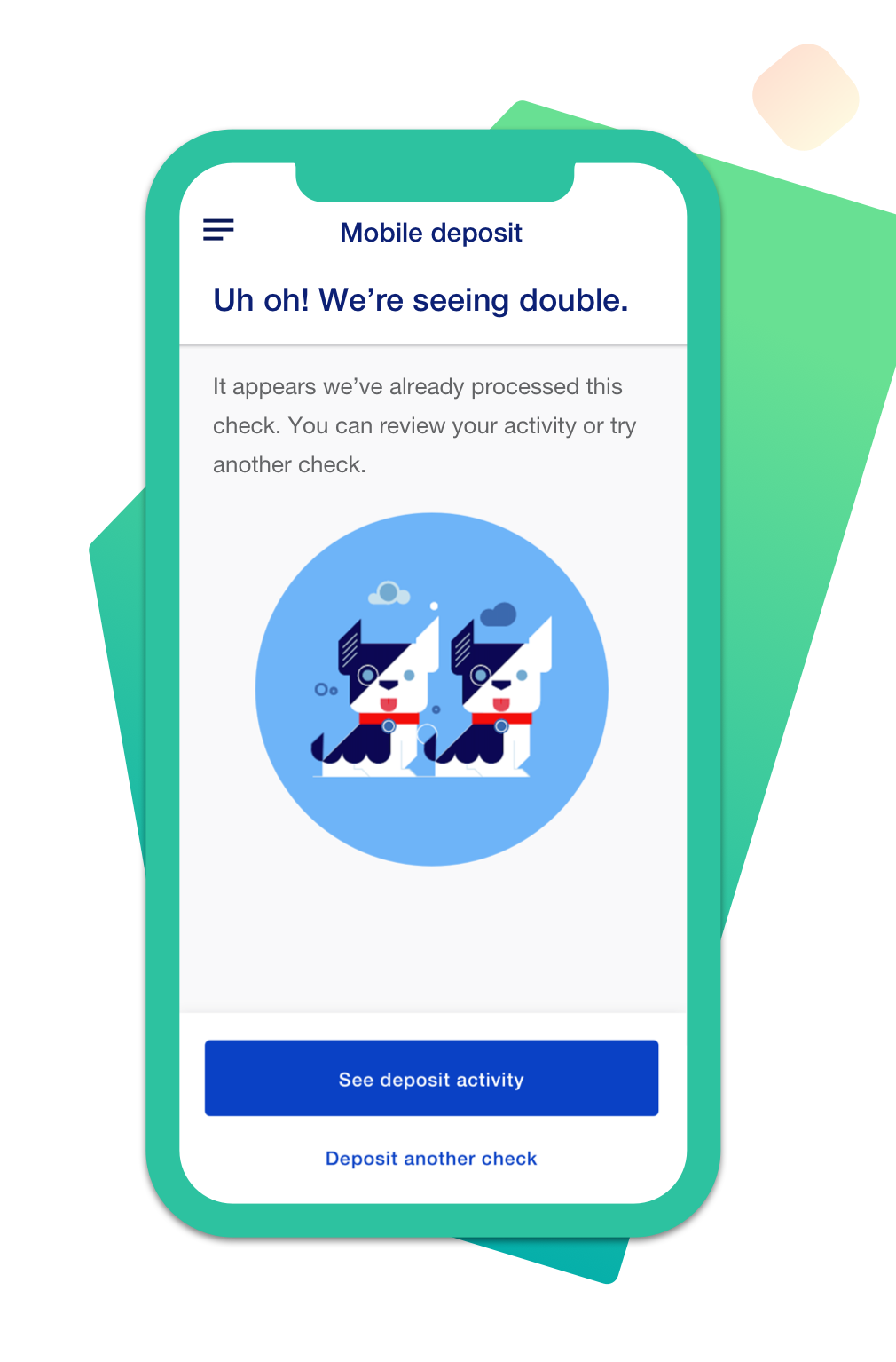
Cute corgi dogs greet the user upon finding that a check has already been deposited.
Closing
Our work has inspired other teams to identify elements for whimsy and delight. Our team has become the launch pad for multiple different initiatives that continues til this day. We’re happy to see how how a little bit of whimsy is positively affecting our users and their experience.
You may also like:

Treasury Check? Yes, we do that.
Supporting treasury checks became a need overnight.

Turning Bill Pay into Pay Bills Transforming the way we pay bills.
Discover Autopay.
Dig into how we defined the pain points with autopay.